Before attending the international art fair at Art Basel, I was museum hopping in Basel, including the Kunstmuseum and Fondation Beyeler. With so much of art to witness in a short span of five days, I geared myself up for the main event i.e. Art Basel – that showcased about 270 leading art galleries from all over the world, and each art gallery presenting at least 10 premier artworks in their space – which roughly sums up to over 3000 artworks in one place. Viewing 3000 artworks could be nothing less than fascinating for an art lover, but given the time to see, understand and appreciate these artworks was pretty hectic as well as difficult at the same time.
Each of the artworks was significant in its own way and hence the international galleries brought them to be showcased at the world’s spotlight art event. However, in this blog, I have chosen to write about 22 artworks that made me happy in spite of my hectic gallery hopping tour.
These artworks made me happy because of their aesthetic value, the use of material, medium and scale – be it conceptual art, innovative or skilled based work. This is not a review, rating or a critical view. This is a curator’s view on the artworks and I am sharing what I found interesting and why. The numbers do not determine the rank or my preference.
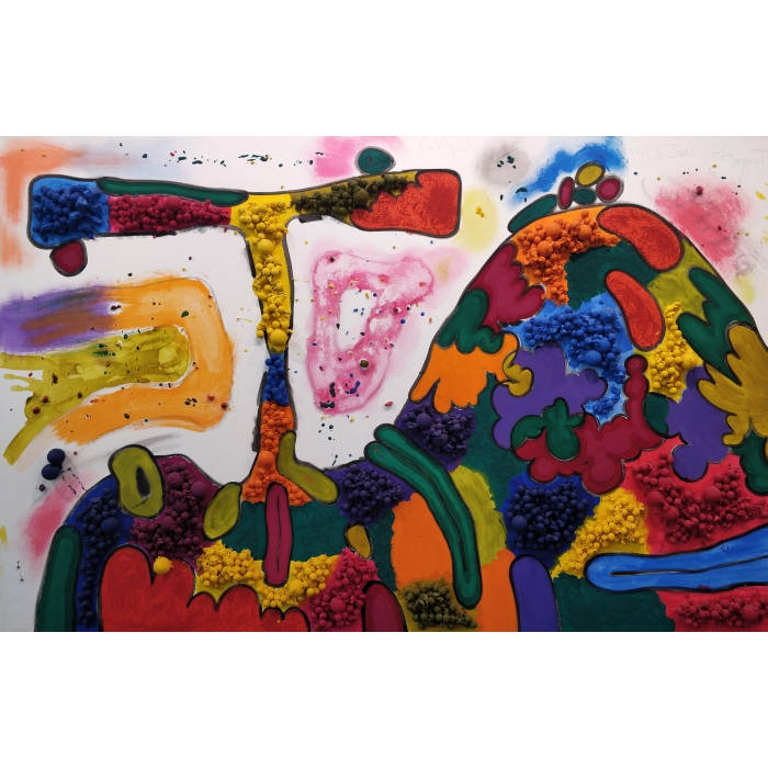
1. Bouquet in a Sculpted Vase Beside a Wreath of Flowers by Matthew Day Jackson
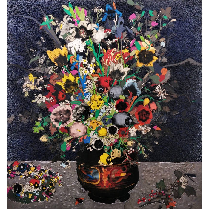
157.8 x 153.7 x 5 cms, 2018, presented by Hauser and Wirth
This became one of my favorite artworks considering the use of materials and the medium. The harmony of the mediums like formica, silkscreen, acrylic paint, fibreglass cloth, and lead on the epoxy panel made the artwork look brilliant. The beauty of this artwork emerges because of each material leaving its individuality and identity on the canvas. No one eats into the other and are yet so well coordinated. The work is simply a feast to the eyes. Be it the technique, skill, materials, composition or the decorative and aesthetic sense – the concept of renaissance still-life infused with modern day approach make the artwork stunning and innovative. Right from the surface creation to colours used in the final finishing, everything is top class.
2. Integrated Painting Four by Carroll Dunham
60 x 95 inches, 1992, presented by Blum and Poe
This mixed media on linen is vibrant and cheerful. This was one of the fewest works in the fair that I found to have so much colour and vibrancy in it. The childlike natural forms and the composition made me feel relaxed and happy. The use of colourful balls looked very western as well as Indian to me. I feel that it is very important for an artist to manage the material and see to it that it finds equal importance within the painting. With sculptures it is easy, but with paintings I feel the material is like a guest trying to fit in the family. The material used here merged very well with the colours and composition. It didn’t look like it was forced or the material is finding a place to fit in.
3. Flowers That Blossom Tomorrow by Yayoi Kusama
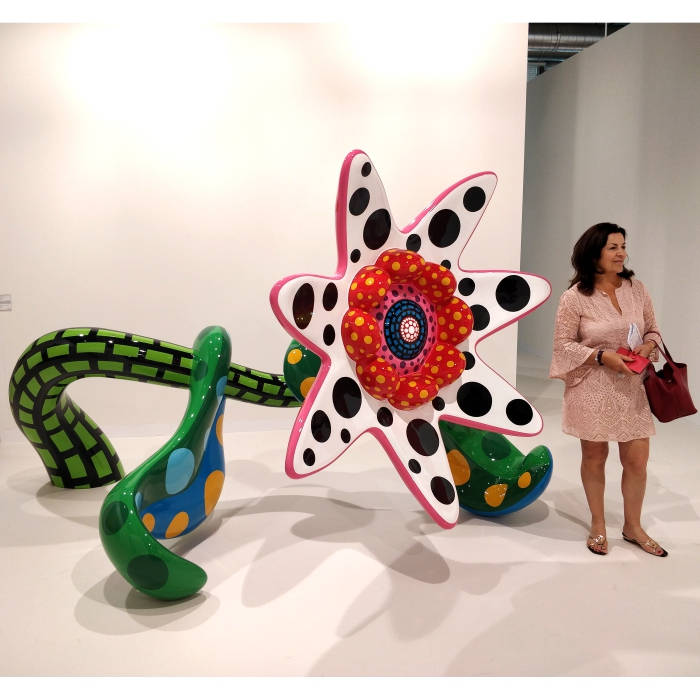
200 x 340 x 200 cm, 2010, presented by Victoria Miro
I found this artwork a perfect example of art as a commodity. Keeping the concept simple, the presentation and finishing of the product comes in forefront – and that a consumer loves to see, use or collect. The craftsmanship of this work is just amazing. The “glossy candy cane-like look” of this product is the main attraction. The finishing and material with fibreglass-reinforced plastic, metal and urethane paint has been used to its best. On the art front, this work is just like its subject – sweet and tender. The work has freshness and young feel to it. The edginess and quirky colours will definitely attract young collectors.
4. The Invisible Enemy Should Not Exist by Michael Rakowitz
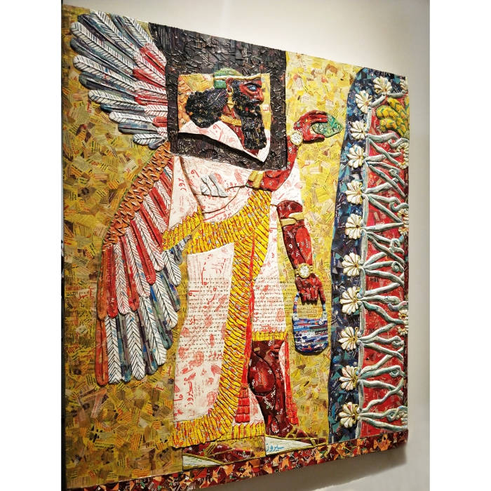
2018, presented by Barbara Wien and Rhina Hoffman Gallery
Using materials like relics from Middle Eastern packaging and newspapers, cardboard and wood, the artist has beautifully recreated this striking historical artwork. I loved his concept of preserving the stolen, damaged or destroyed relics from the 2003 US invasion from the National Museum of Iraq, Baghdad and Mesopotamian cultural heritage by groups such as ISIS. What was interesting for me was that he collaborated with the Oriental Institute of University of Chicago to reconstruct them. I feel this artwork is important for two reasons:
(i) It idealises the concept of preserving our history by using Middle Eastern products, packages and other such contemporary materials. This is like preserving our past with what we have today – an important ‘universal’ message for today’s youth.
(ii) The collaboration with different faculties for authenticity and additional source of material makes the work more genuine and effective. It also brings together more and more people or societies in part of making an artwork.
5. Clock of Ghosts by Meschac Gaba
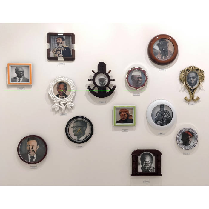
2018, presented by Stevenson
This is just the kind of artwork I would love to see in my collection. What fascinates me in this artwork is that it showcases art and history together. I am not sure whether the artist has collected these works from various places or created them on his own. What I love about this concept is that to me it shows the world’s most controversial leaders as well as depicts the same time (character) by different shaped clocks (that means different time, different socio-economic situation, society, people, demographics and culture). I found the concept to be very indigenous and effectively presented.
6. Death Star II by Robert Longo
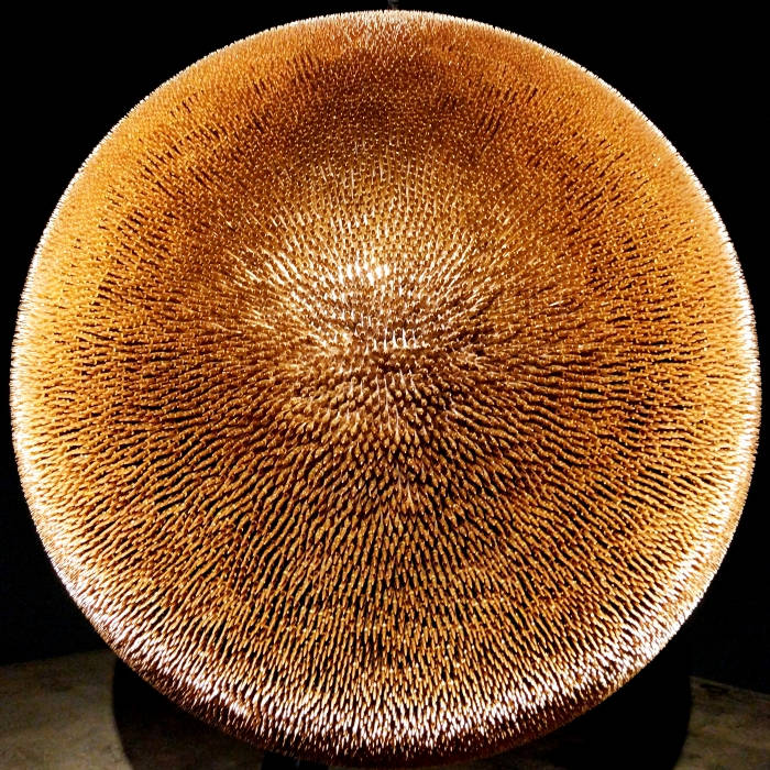
2017/18, presented by Metro Pictures and Galerie Thaddaeus Ropac
This artwork is created with 40,000 copper and brass full metal jacket bullets. 40,000 !!! When I saw this artwork, I understood that it is a social issue packaged in a sexy contemporary manner. The beauty lies in how the concept manages its aesthetics sensibilities and at the same time does not lose it while conveying the social message. It doesn’t turn into a subject-based or conceptual artwork with no attachment to art or aesthetics. At the same time you are made aware of the mass shooting culture in the United States of America in the last two decades. I like provocative artworks that make you think and at the same time entertain you.
7. Alternative Facts by Paul Ramírez Jonas
2017, presented by Nara Roesler
This was the ONLY interactive artwork – installation or live art that I could find in Art Basel 2018. I was looking for more of such alternative artworks but sadly couldn’t find many. This artwork was always so busy that I couldn’t interact with the artist but what I observed was that the artist asked few questions and out of all the questions there came one conclusion at the end. That was what he notarised and pasted on the wall with his seals and stamps. I liked how the artwork was presented and approached by people. As the name suggests, it gave an option to alternative artworks and alternative facts in people’s lives as well. What can be better than an art that can connect with people?
8. What If We All Just Stopped? By Mariele Neudecker
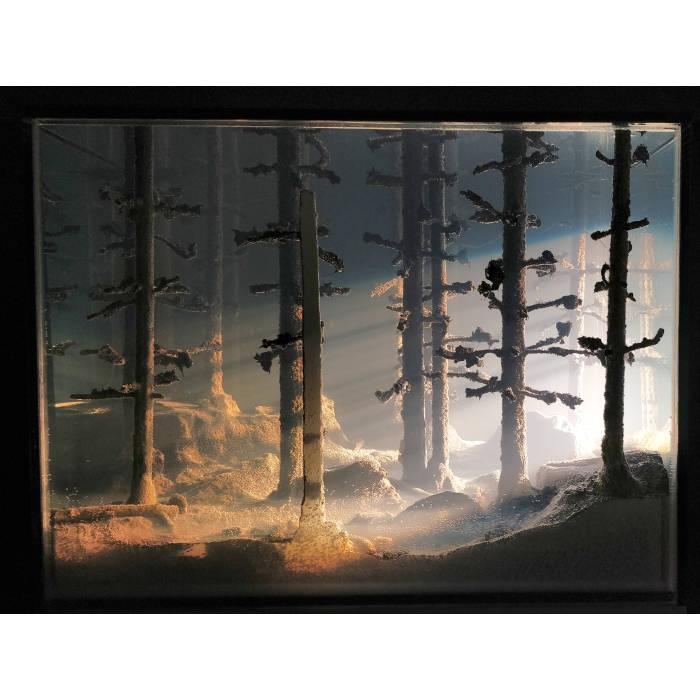
71.8 x 66.1 x 54.6 cm, 2018, presented by Pedro Cera
This proved to be one of those rare artworks whose ‘Title’ resonated with the ‘Feeling’ of the ‘Viewer’. I literally felt STOPPED looking at the work. All the things around me STOPPED while I enjoyed this beauty. Many interesting thoughts and moments passed by while looking at this artwork. It was very cinematic, real and dramatic with the light falling in from a distance. For a moment I thought I was standing in Shimla or Darjeeling just like they show in Bollywood films. The use of glass, water and resin with real material like trees and rays of light can only be experienced in person.
9. Um Chapéu Que Nos Acolhe by Ernesto Neto
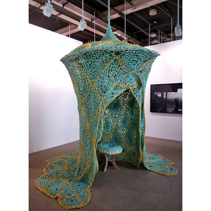
420 x 330 x 330 cm, 2016, presented by Fortes D’ Aloia and Gabriel
This ‘Hat’ (meaning of the title) that welcomed me as an artwork, made me relate the concept to an Indian fairy-tale. The use of feminine colours seemed very sensual. The net and layers suggested as if it welcomed the viewer, at the same time it also represented the privacy of a woman’s room – very fragile, giving a ‘’touch-me-not’ feel for a woman to be seated on that seat. The flow of the material and texture elevated the emotion of sensuousness to the next level.
10. GALAXY. Project for a monument in Houston, Texas by Horia Damian
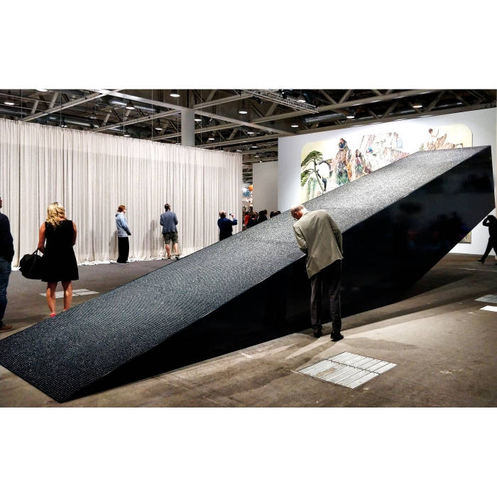
350 x 1156 x 200 cm, 1972-2018, presented by Galeria Plan B
This monumental installation in black was sheer joy in scale. I loved the shape and its display. The angle was pointing towards the sky. This 11 meter long sculpture is a super example of fictional monumental art. The artist has used wood, pressed paper balls and oil paints in a very simple yet effective manner. It requires lots of skill and patience.
11. Shoonya Ghar by Sudharshan Shetty
60 minute video, 2015, presented by Galerie Krinzinger
This video was a reflection of Indian culture for the non-Indians. The content of the video had some moments which were nostalgic, shocking and provocative. The philosophical approach in this artwork reached its zenith with the perfect use of music, actors, visuals and storytelling. I loved Shetty’s style of narration – which has a loop effect of silence, action, music.
12. Soundsuit by Nick Cave
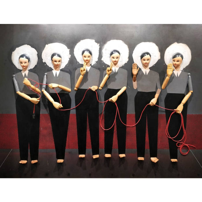
244 x 61 x 51 cm, 2018, presented by Jack Shainman Gallery
It was a visual treat for me to witness this beautiful example of marriage between modern elements and contemporized concept. The past and current elements coming together in this artwork holds the value of both the worlds. The use of objects such as vintage textile, sequined appliques, metal and mannequins enhances the subject that the artist wanted to convey. The choice of colours used is also interesting – with grey, red and white mainly focusing on the concept. The way the wire has been used in the form of ‘hand gestures’ – gives the impression of real action taking place – which make the work interesting, interactive and likeable.
13. Untitled by Ray Parker
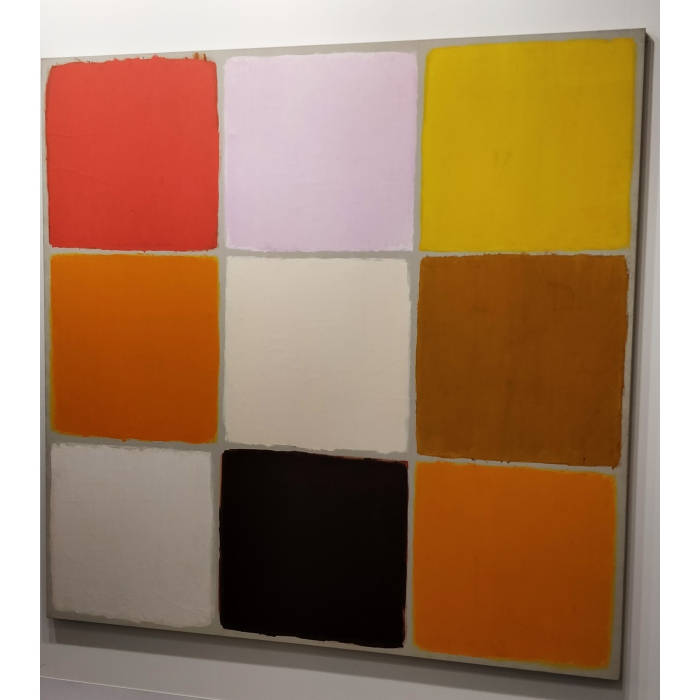
81 x 82 in., 1964
Scale and style defines this oil on canvas. The minimalistic approach and colours give a different perspective to systematic painting style. There are certain works where you don’t think much, you simply fall in love with them. And you don’t know the reason behind falling in love with that artwork. You FEEL for certain works. That reason may be the size, colours, approach, the artist, or anything else, varying from viewer to viewer. This artwork comes in the above category for me. You just love it. When you love something, you don’t see a logic or try to find a reason behind it.
14. The Actress by George Condo
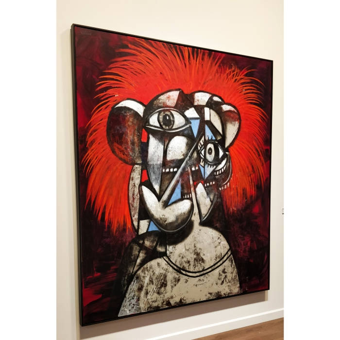
92 x 78 in., 2018 presented by Skarstedt
Firstly, I am completely obsessed with big sized works. Secondly, the ‘actress’ has some great expressions to it. The background displays prominent colours with orange and red being very striking, provocative and strong with acrylic and pigments being stuck on linen. This defines the personality and character of this ‘actress’ in frame. The cubes in the artwork give me the feel of this woman’s different moods at different times shown in one frame. This provides a varied range of dimension to this artwork.
15. Untitled by Peter Vermeersch
131.5 x 114.5 x 2 cm, 2018, presented by Perrotin
There are artworks which are visually powerful and then there are artworks which are conceptually powerful. Then comes the artworks which are based on sheer concept. It is not necessary that it may be visually or technically great too. I felt the same for this oil on marble. I liked this unique idea of oil on marble. My interpretation of this work would be the journey of one’s life from struggle to success, from rough surface to polished life.
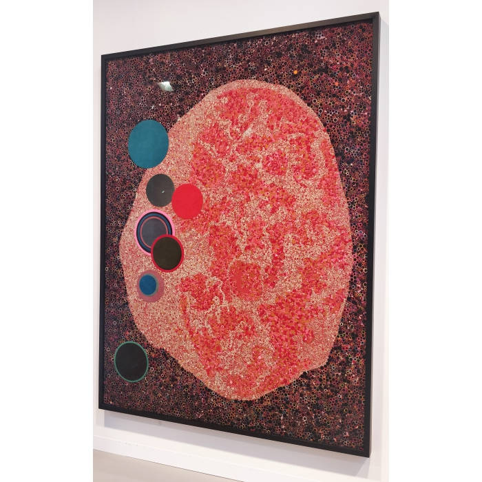
16. Dark Matter II by Bharti Kher
250 x 189 cm., presented by Perrotin
Any object that an artist uses from her/his culture is noteworthy for me. The dark matter which has ‘Bindis’ on painted form is one such work. It symbolises the universe of ‘Bindis’ and in a way Indian women and the strong sentiment of feminism that is represented in Indian culture. This work reconnected me to India, the country I had left just a few days back to visit Art Basel fair. I was missing my country and this artwork, in a way, got me back to India. I felt emotions similar to what a Non-Resident Indian (an NRI) might be feeling while looking at a painting which has an Indian element and this, in turn, made me realize why artwork with Indian touch sell so much – for obvious reasons like the feeling of nostalgia, an attachment or reconnection to one’s emotional roots and culture.
The composition of the work is also interesting. I loved how the colourful ‘Bindis’ make the background and support the foreground. This work by Kher involves culture, natural material, concept, planning, skill, visual power, aesthetics and most importantly, patience.
17. Un Village Sans Frontières by Chen Zhen
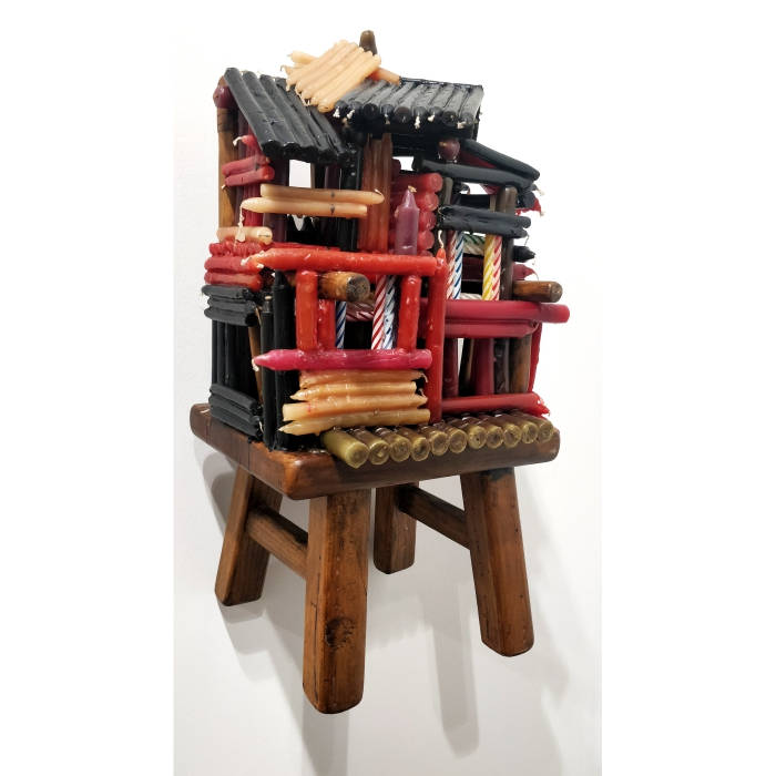
2000, presented by Galleria Continua
I am sure most of us might not have seen such brilliant use of candles in an artwork. I am not sure if any contemporary artist in current times can create such an artwork. This is only possible by an artist of an older generation – who is connected to his roots, his village, the nostalgic memories of his childhood, and would have lived in these conditions – only then can he so easily make such an artwork. To many it may appear to be a craft work or a hobby work but it is one of my favourite artworks owing to the material used and its presentation skills. The table for his idea and guts to use this material is mind-blowing. I would have thanked Chen Zhen personally for gifting the society and the future generation such an amazing work.
18. Geheimnisse des Unbekannten by Peter Wuthrich
150 x 152 cm., 2006, presented by Galleria Christian Stein
The ‘Secrets of Unknown,’ where 30 Black Books have been placed in symmetry, makes the viewer think – What is there in these books? Can I read them? Can I touch them? What if I find some secret? Whose secret would be there? It provokes questions in your mind and makes you think. It is successful in delivering what it means by its title. There is always a challenge for the artist to make the viewer feel the same connect that he or she has perceived while making such an artwork. The rightly placed books, the black mass – plays a major role in hiding the secret behind these books. I found this work to be dramatic in a literal sense. The artwork is also unique in a sense that it is created simply by placing books. Simple yet powerful.
19. Untitled by Joel Shapiro
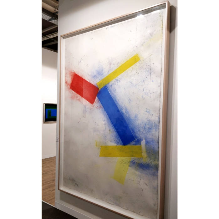
224.8 x 152.4 cm., 1988, presented by Anthony Meier Fine Arts
“Warm and soft…just like the neck of a beautiful girl…” – those were my first feelings while looking at the artwork. It was love at first sight for me as I looked at the scale of the work and just its four strips. The pastels too are soft while the size of the paper is overwhelming. The white is so powerful yet so much at peace. I loved the contrast and the use of red, blue and yellow – soft to opaque and opaque to transparent – all in one breath. If I had enough euros 🙂 I would have definitely bought this artwork at the moment. This minimalistic work kept me glued each day that I visited the Art Basel fair – for its colour, size, composition, form and softness.
20. Yves Klein
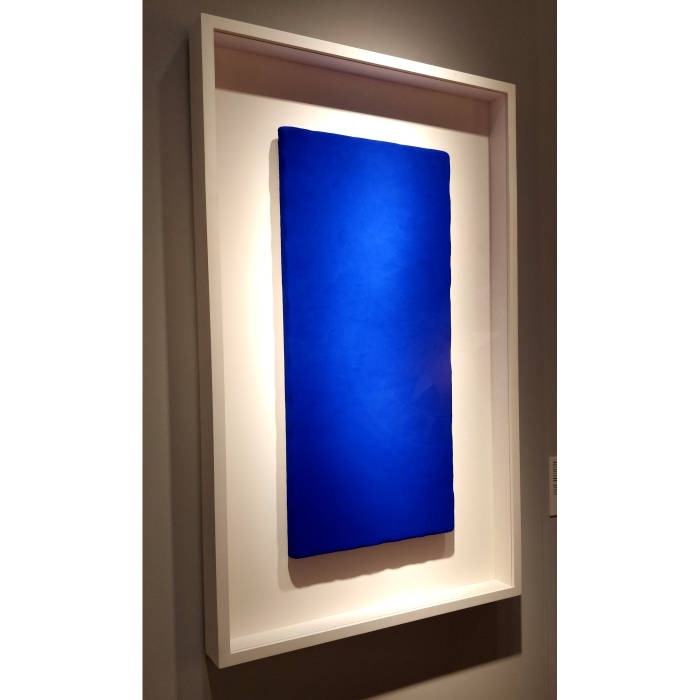
74.5 x 35.3 cm., 1955
Who can ever miss the ‘Blue’ of Yves Klein. When I saw this artwork, the first thing that came to my mind was that how fortunate have I been to see Yves Klein’s ‘Blue’ live. The Indian indigo-like blue was striking like a diamond. It seemed as fresh as it was when created in 1955. To me this slab of linen panel was like a Gold Bar to a jeweller, using Blue metal instead of Yellow.
21. Obo 54 by Tony Oursler
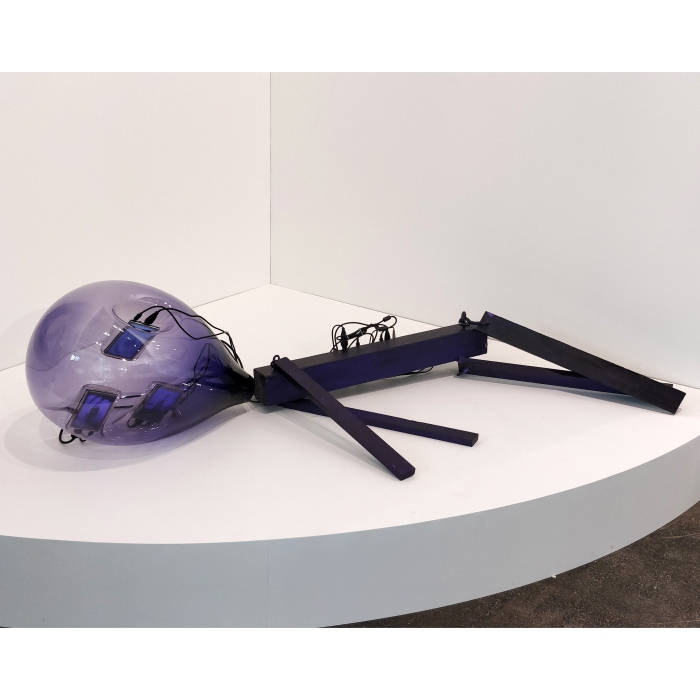
55.9 x 88.9 x 152.4 cm., 2018, presented by Galerie Hans Mayer
What happens when technology meets animals? We talk of human robots, but what if we create robotic animals where their eyes and mouth are represented by small LEDs, their emotions are displayed through screens, and sound by audio? While the body is made of steel, the heart is governed by a computer. This thought is interestingly captured by the artist. A lot more can still be imagined and thought of. I liked how the artist displayed the animal sleeping in a corner.
22. Dope and Corruption by Ragnar Kjartansson
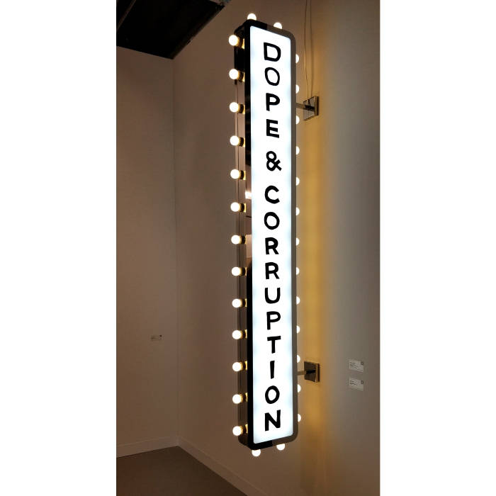
2017, presented by i8
Who would do such an artwork? This artist called Ragnar Kjartansson did it. Glamorising the evils on a signboard! The two major problems that the powerful breed of humans in the world is facing, mainly the rich and famous, whatever field they may be in – glamour, sports, business, politics, art. I loved how the artist presented this concept to the viewers. The use of material here is simple but very effective. This is what I like about this kind of art – edgy and super effective. With the unconventional use of material, it looks REAL and the effect is indeed REAL. This effect wouldn’t have been similar if the artist would have painted the same on canvas. The reason ‘why the use of material is important to be in accordance to the subject’ can be learnt from this artwork.
Note – The abovementioned comments are my personal views and observations. These are the gist of what I interpret/felt looking at the aforementioned artworks. I haven’t discussed any of these artworks with any of the artists or members of the gallery.